Close, back to all work

Weya Beauty

  • Branding
  • Packaging

2025

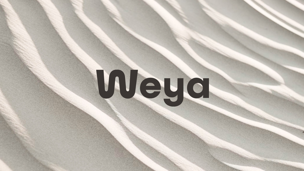
Weya logotype on sand

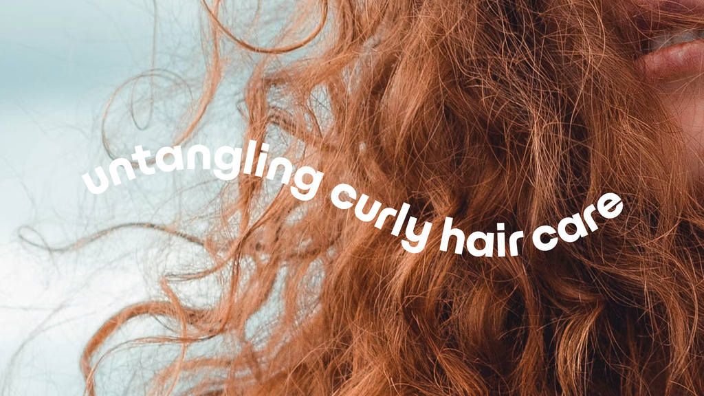
Branding and packaging design for Weya, a Scandinavian beauty brand offering haircare products crafted with natural ingredients. Simple and accessible products for waves and curls — Weya is untangling curly haircare.
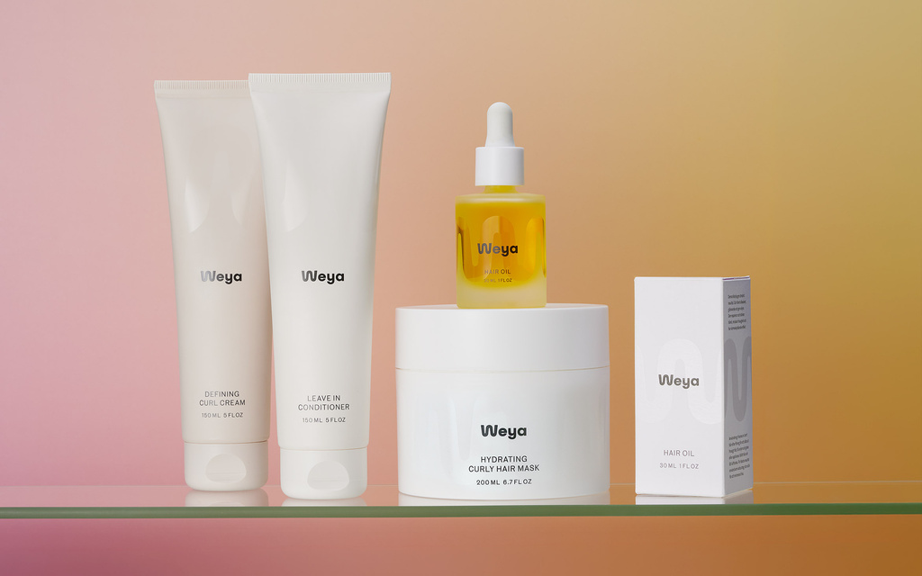

Scandinavian simplicity combined with the playfulness of the wave.
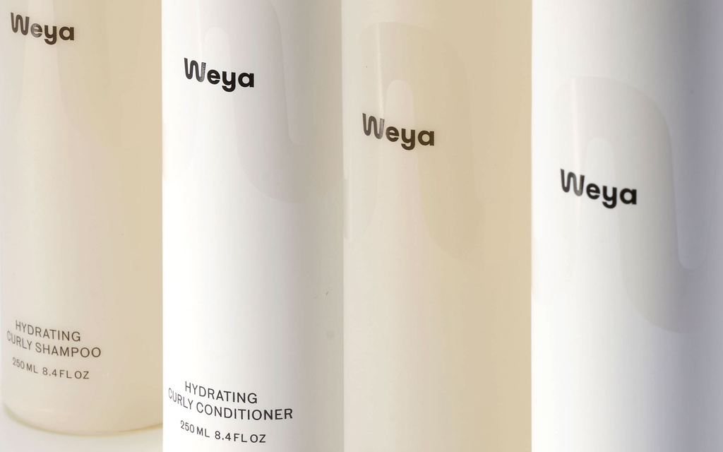
Scandinavian simplicity combined with the playfulness of the wave.
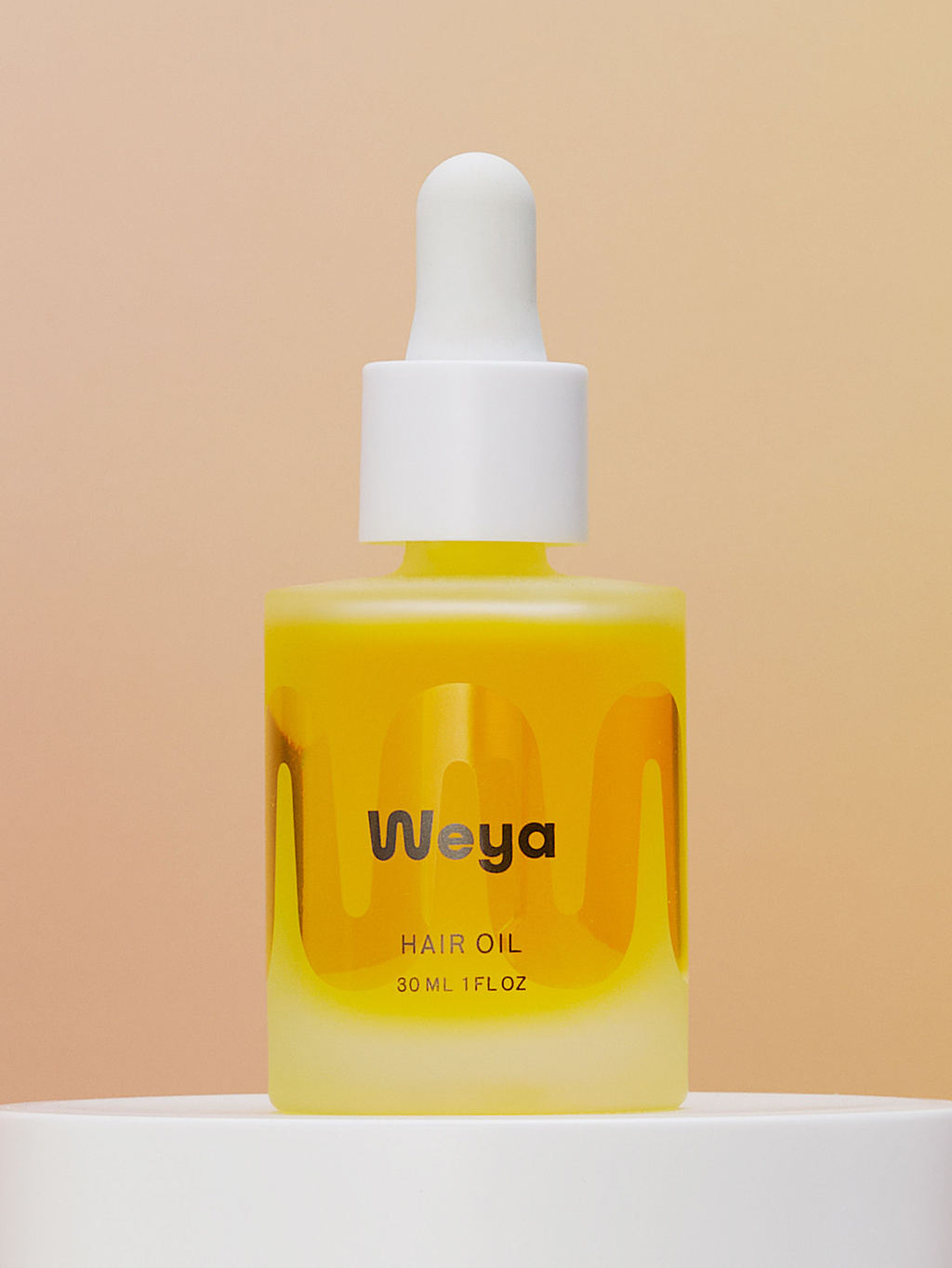
Hair oil flask
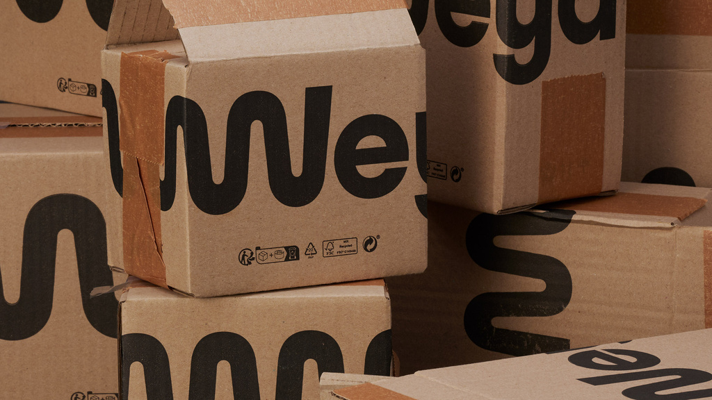
The wave graphic is designed to resemble the letter W when viewed from the front.
The wave graphic is designed to resemble the letter W when viewed from the front.
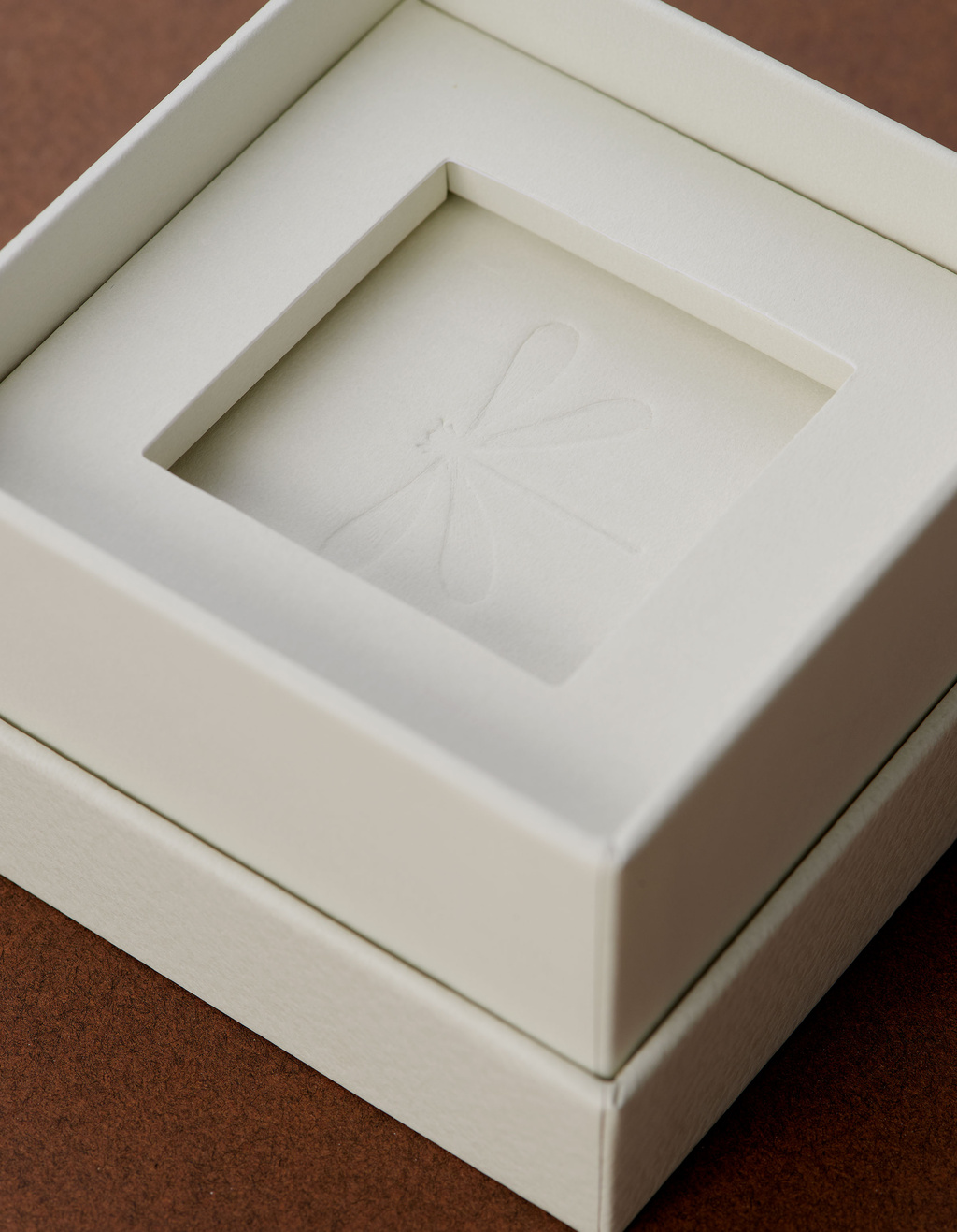
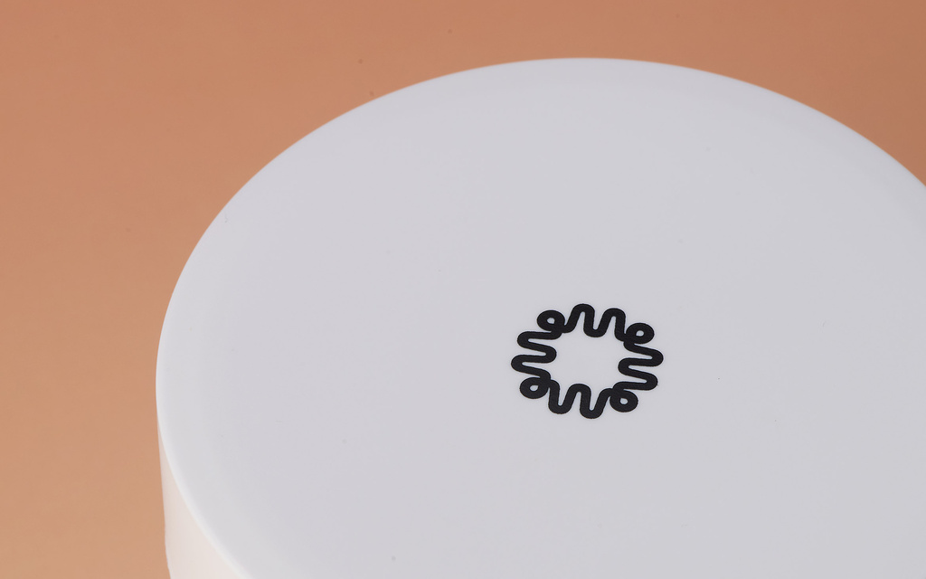
Top of packaging with symbol.
Symmetrical symbol as a subtle detail on packaging.
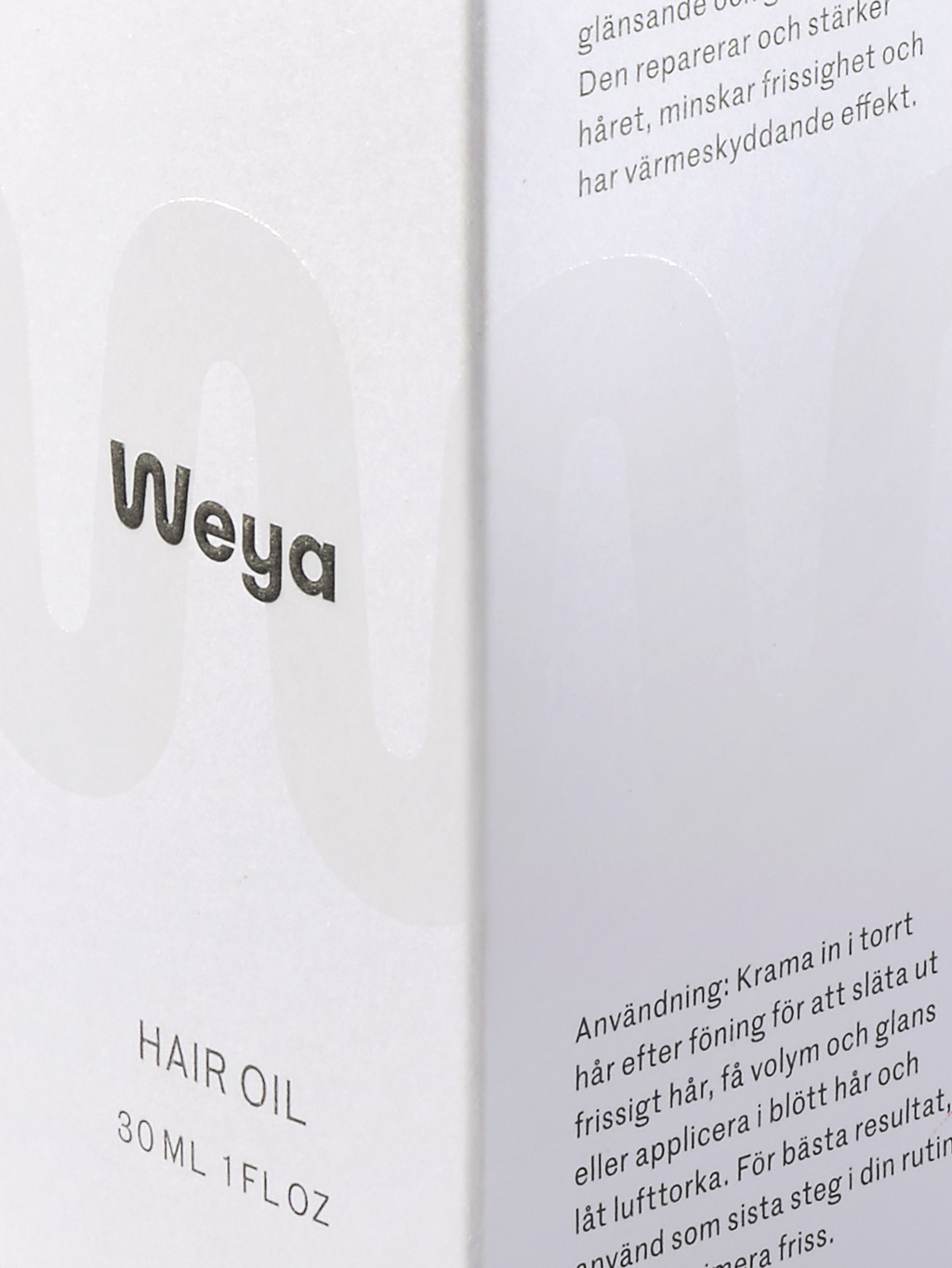
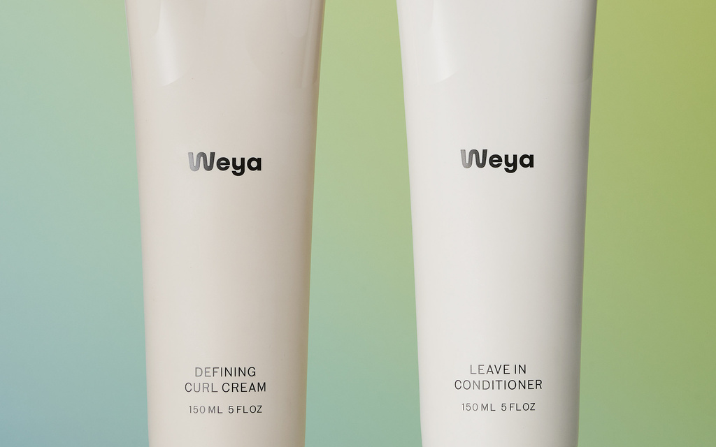
Two zoomed in packaging next to each other.
The soft logotype is balanced by a more structured, geometric typeface.

Get in touch

Discuss a project? Email us at hello@atombureau.work.